Model weighting with rTPC
Daniel Padfield
2026-04-09
Source:vignettes/model_weighting.Rmd
model_weighting.RmdA brief example of how model weighting can be used to help account for measurement uncertainty when fitting models to TPCs using rTPC, nls.multstart, and the tidyverse.
Things to consider
- The optimal weighting is \(\frac{1}{\sigma}\). The standard deviation is easy to calculate when calculating the means of the rate data.
- Carefully consider your level of replication before undertaking your
statistical analysis.
- What is your level of replication?
- Do you have biological replicates or technical replicates?
- Do you have non-independence in your dataset?
# load packages
library(rTPC)
library(nls.multstart)
library(broom)
library(tidyverse)
library(ggrepel)
The general pipeline demonstrates how models can be fitted, parameters extracted, and predictions plotted to single or multiple curves using functions in rTPC, nls_multstart(), and purrr.
Using model weights
Here, we demonstrate how this pipeline can easily be extended to
incorporate measurement uncertainty by using the weights
argument of nls_multstart(). Methods of fitting TPCs in
the literature often fit models to averaged rate values at each
temperature. This fits a model on the mean rate value, but often the
variation around this calculated mean value is ignored. However, there
may be more spread in the rate data at the extreme temperatures (very
hot or very cold). Ignoring the homoscedasticity in the data may alter
the model fit.
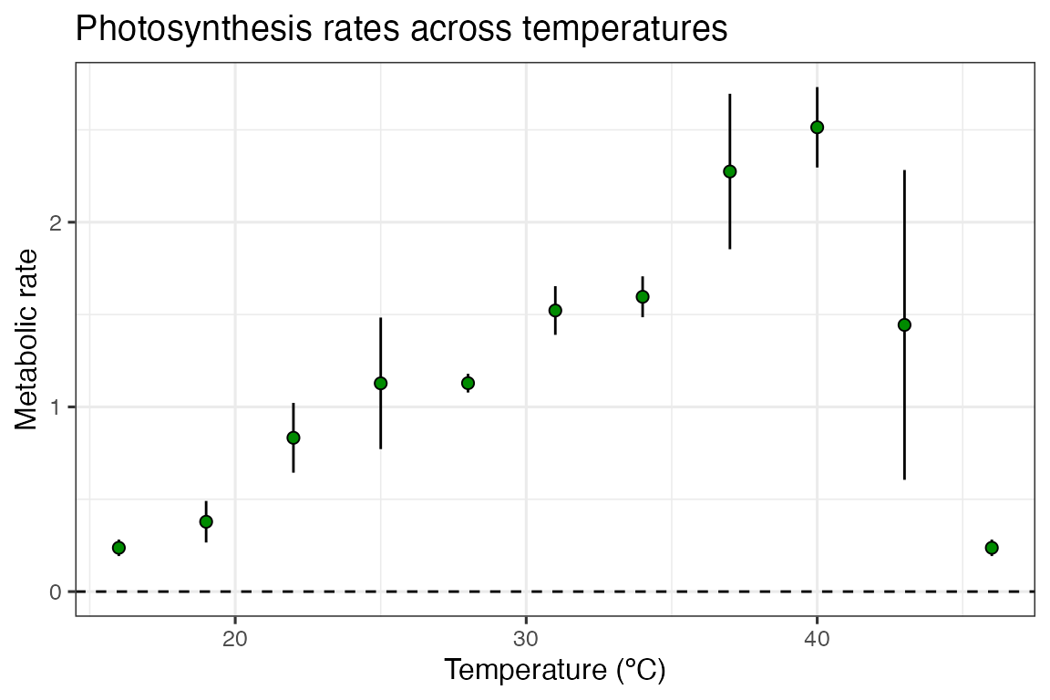
Instead, we can incorporate measurement uncertainty using the weights argument within nls_multstart(), to perform a weighted non-linear least squares regression. The optimal weight for each data point is the standard deviation, \(1/\sigma\), which easily be calculated when averaging over technical or biological replicates.
We can demonstrate weighted non-linear least squares regression by
using the example dataset contained within rTPC - a
dataset of 60 TPCs of respiration and photosynthesis of the aquatic
algae, Chlorella vulgaris. Instead of plotting a single curve,
we average over the biological replicates, rep, within a
growth temperature, to get mean rate values at each assay temperature
and their standard deviation. These are then plotted using
ggplot2.
# get curve data
data("chlorella_tpc")

d_ave <- filter(chlorella_tpc, process == 'adaptation', growth_temp == 33, flux == 'photosynthesis') %>%
  group_by(temp, flux) %>%
  summarise(., sd = sd(rate),
            ave_rate = mean(rate)) %>%
  ungroup()
#> `summarise()` has regrouped the output.
#> ℹ Summaries were computed grouped by temp and flux.
#> ℹ Output is grouped by temp.
#> ℹ Use `summarise(.groups = "drop_last")` to silence this message.
#> ℹ Use `summarise(.by = c(temp, flux))` for per-operation grouping
#>   (`?dplyr::dplyr_by`) instead.

# plot
ggplot() +
  geom_linerange(aes(x = temp, ymin = ave_rate - sd, ymax = ave_rate + sd), d_ave) +
  geom_point(aes(temp, ave_rate), d_ave, size = 2, shape = 21, fill = 'green4') +
  theme_bw(base_size = 12) +
  theme(legend.position = 'none',
        strip.text = element_text(hjust = 0),
        strip.background = element_blank()) +
  labs(x ='Temperature (ºC)',
       y = 'Metabolic rate',
       title = 'Photosynthesis rates across temperatures') +
  geom_hline(aes(yintercept = 0), linetype = 2)
In this example, the standard deviation in our rates are actually smallest at the extreme temperatures, counter to what we previously expected.
We will use the workflows outlined in the previous vignettes on fitting many models and fitting many curves to fit both weighted and standard non-linear least squares regression, and we will use the kamykowski_1985() in this example - purely because it has not been used in previous vignettes as of yet.
# fit kamykowski model using rTPC with and without weights
d_fits <- nest(d_ave, data = c(temp, ave_rate, sd)) %>%
  mutate(standard = map(data, ~nls_multstart(ave_rate~kamykowski_1985(temp = temp, tmin, tmax, a,b,c),
                        data = .x,
                        iter = c(4,4,4,4,4),
                        start_lower = get_start_vals(.x$temp, .x$ave_rate, model_name = 'kamykowski_1985') - 10,
                        start_upper = get_start_vals(.x$temp, .x$ave_rate, model_name = 'kamykowski_1985') + 10,
                        lower = get_lower_lims(.x$temp, .x$ave_rate, model_name = 'kamykowski_1985'),
                        upper = get_upper_lims(.x$temp, .x$ave_rate, model_name = 'kamykowski_1985'),
                        supp_errors = 'Y',
                        convergence_count = FALSE)),
         weighted = map(data, ~nls_multstart(ave_rate~kamykowski_1985(temp = temp, tmin, tmax, a,b,c),
                        data = .x,
                        iter = c(4,4,4,4,4),
                        start_lower = get_start_vals(.x$temp, .x$ave_rate, model_name = 'kamykowski_1985') - 10,
                        start_upper = get_start_vals(.x$temp, .x$ave_rate, model_name = 'kamykowski_1985') + 10,
                        lower = get_lower_lims(.x$temp, .x$ave_rate, model_name = 'kamykowski_1985'),
                        upper = get_upper_lims(.x$temp, .x$ave_rate, model_name = 'kamykowski_1985'),
                        supp_errors = 'Y',
                        convergence_count = FALSE,
                        # include weights here!
                        modelweights = 1/sd)))

d_fits
#> # A tibble: 1 × 4
#>   flux           data              standard weighted
#>   <chr>          <list>            <list>   <list>
#> 1 photosynthesis <tibble [11 × 3]> <nls>    <nls>
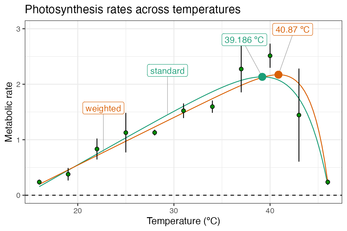
We can then get the predictions and plot them as before.
# stack models
d_stack <- select(d_fits, -data) %>%
  pivot_longer(., names_to = 'model_name', values_to = 'fit', standard:weighted)

# get predictions using augment
newdata <- tibble(temp = seq(min(d_ave$temp), max(d_ave$temp), length.out = 100))
d_preds <- d_stack %>%
  mutate(., preds = map(fit, augment, newdata = newdata)) %>%
  select(-fit) %>%
  unnest(preds)

# take a random point from each model for labelling
d_labs <- filter(d_preds, temp < 30) %>%
  group_by(., model_name) %>%
  sample_n(., 1) %>%
  ungroup()

# get topt for each model
d_topt <- mutate(d_stack, topt = map_dbl(fit, get_topt), rmax = map_dbl(fit, get_rmax),
                 topt_text = paste(topt, 'ºC', sep = ' '))

# plot
ggplot(d_preds) +
  geom_line(aes(temp, .fitted, col = model_name)) +
  geom_label_repel(aes(temp, .fitted, label = model_name, col = model_name), fill = 'white', nudge_y = 0.8, segment.size = 0.2, segment.colour = 'grey50', d_labs) +
  geom_linerange(aes(x = temp, ymin = ave_rate - sd, ymax = ave_rate + sd), d_ave) +
  geom_point(aes(temp, ave_rate), d_ave, size = 2, shape = 21, fill = 'green4') +
  geom_label_repel(aes(topt, rmax, label = topt_text, col = model_name), fill = 'white', nudge_y = 0.8, segment.size = 0.2, segment.colour = 'grey50', d_topt) +
  geom_point(aes(topt, rmax, col = model_name), size = 4, d_topt) +
  theme_bw(base_size = 12) +
  theme(legend.position = 'none') +
  labs(x = 'Temperature (ºC)',
       y = 'Metabolic rate',
       title = 'Photosynthesis rates across temperatures') +
  geom_hline(aes(yintercept = 0), linetype = 2) +
  scale_color_brewer(type = 'qual', palette = 2) +
  ylim(c(0, 3))
Here, we can see that weighting the regression by the standard deviation of the average rate value at each temperature increases the optimum temperature by approximately 2 ºC. This is a big relative shift, and could have big consequences for any downstream analyses that might be applied. The model weighting approach can easily be combined with model selection/averaging.